Pharmacy Westmount
over 2 years agoI had the opportunity to set up a website for a pharmacy, in need of an online shop. The client was already using a Lightspeed POS, so adopting its eCommerce platform would allow to have all these integrations under the same ecosystem.
Initially, I opted for a Lightspeed theme in favor of receiving automatic updates. I was able to implement each page and style them as wanted, but I was limited when it came to altering the page layout.
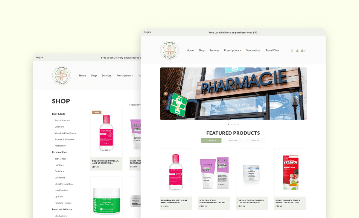
However, in order to achieve features that weren't possible with any of the default themes, I implemented a custom theme instead. This allowed to also address the layout issues due to restrictions in the default theme.

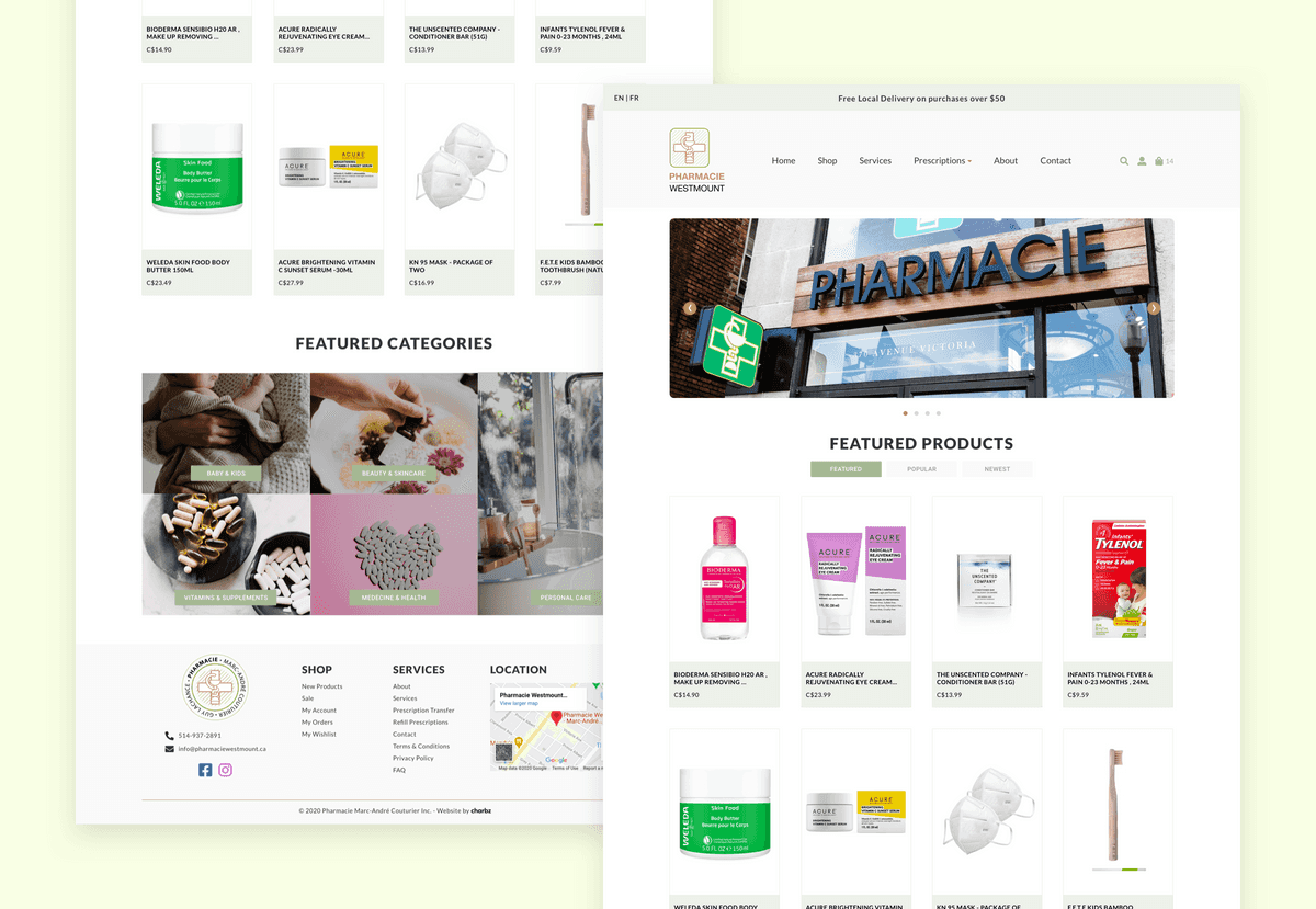
By opting for a custom theme, I took advantage of the Lightspeed API to fetch & display more than just featured products on the home page, but new & popular ones as well.

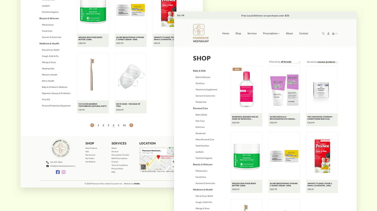
The layout of the Shop page aims to clearly indicate to the user each available functionality on the page. On the left side panel, the user can browse different categories of products. The grid features evenly spaced large previews of each product, in hopes of making the whole browsing experience pleasant and clear.

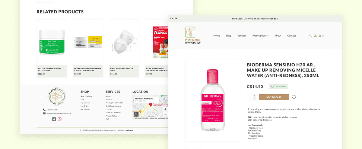
For product pages, the layout consists of the product image on the left side and product info on the right side. All product information is grouped in one focal point, with crucial information such as name, price and CTAs displayed in a bigger font size.
The site is live and can be browsed at pharmaciewestmount.ca.
